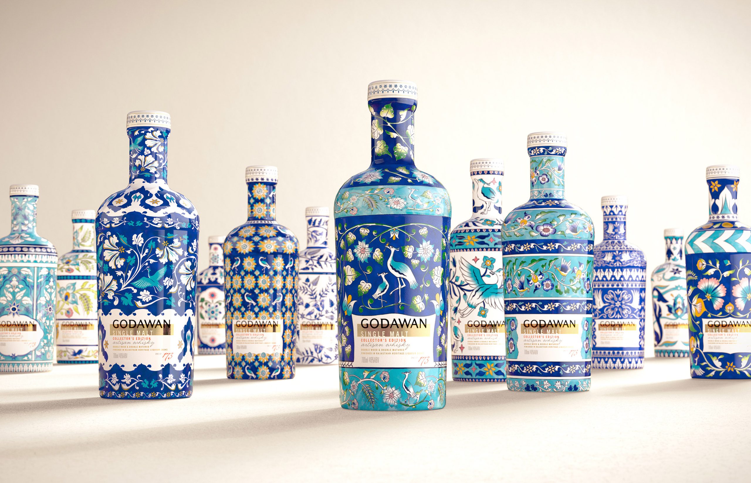
Butterfly Cannon turned Godawan 173’s bottle into a canvas for gorgeous patterns. The typography is calm and centered, letting the illustrated borders do the talking: birds, florals, and geometric repeats that nod to decorative tiles.
Each bottle feels like a different panel in the same visual language, closer to something you’d find on a gallery wall than a bar shelf. In a category obsessed with crests and metallic excess, this approach favors illustration and rhythm over bravado. This is design I want to see more of.